|
This is an example of the year to date climate plot. Observed temperatures are the dark blue, normals are light green , record highs are light red, and record lows are light blue. The bottom portion of the graph indicates the precipitation for the year to date. The yellow line (and green area below it) represents the normal year to date total at the given time frame. Periods that have year to date totals above the climatological normals are shown by dark green areas above the yellow line. Periods that are below normal are shown with the brown areas below the yellow line. 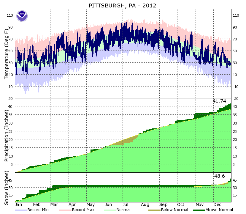 |