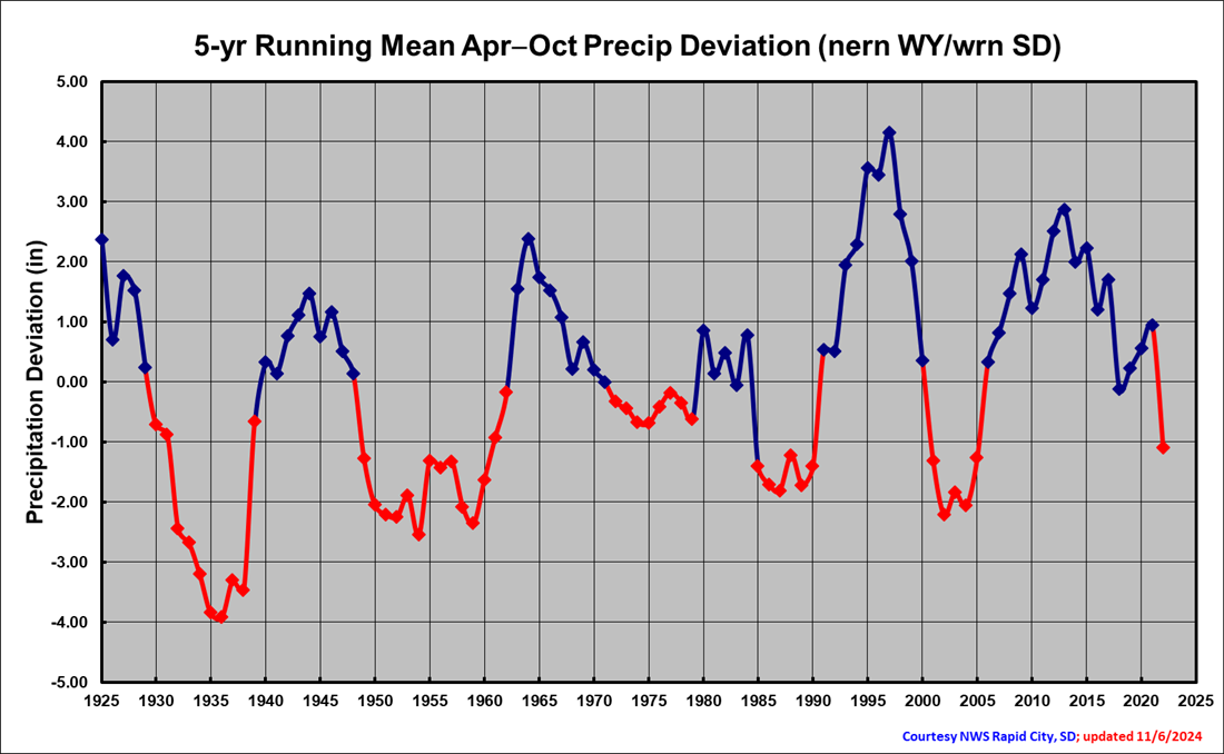
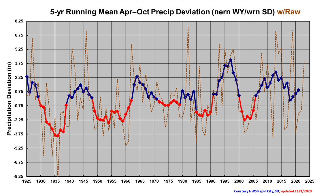
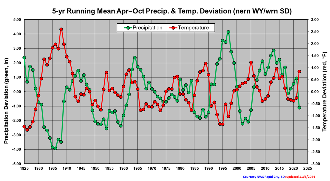
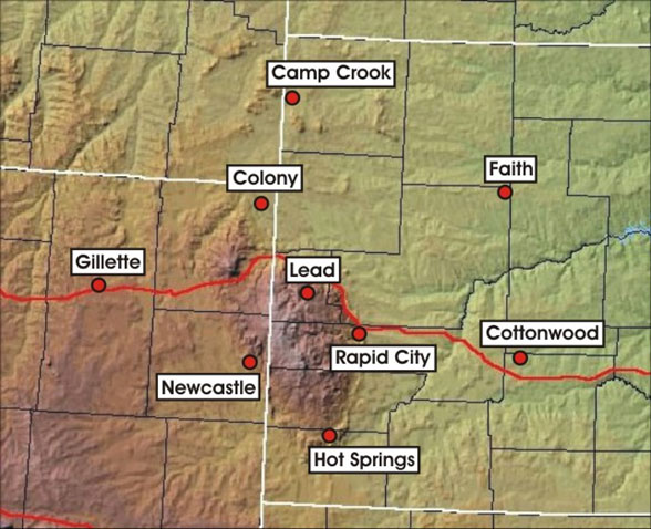
Data from the stations below were used to create the three graphs above. Data from 1925 to 2022 were averaged for all nine stations for April to October (which represents the growing season). For the top graph, a 5-year average was used to smooth the data to help highlight the most consistent signals. Blue parts of the line denote wetter than average periods, while red parts of the line denote drier than average periods. Of interest, there is a signal for 5–10-year periods of mostly wet or dry weather. For the middle graph, the raw yearly data (from the combined nine stations) are plotted as a dashed brown line on top of the 5-year average (from the top graph) to illustrate the year-to-year variability. For the third graph, temperature data (red) for the same stations and using the same methods are plotted on top of the precipitation (green) from the top graph. This shows rather well an inverse relation between temperature and precipitation. Specifically, note how the dry 1930s was the warmest period during this time, whereas the wet 1990s was a relatively cool period.


 Follow us on YouTube