On September 15, NOAA’s Climate Prediction Center (CPC) launched a new look and feel to some of their temperature and precipitation maps to better communicate upcoming climate outlooks across the U.S. The new maps will be used for the 6-10 day and 8-14 day, monthly, and seasonal outlook products.
The upgraded maps offer a substantial improvement in image quality, making them more user-friendly for stakeholders, partners and media outlets. They also offer increased clarity in visualization and improved messaging in the legend to aid in better map understandability to improve decision support across sectors.
 |
|
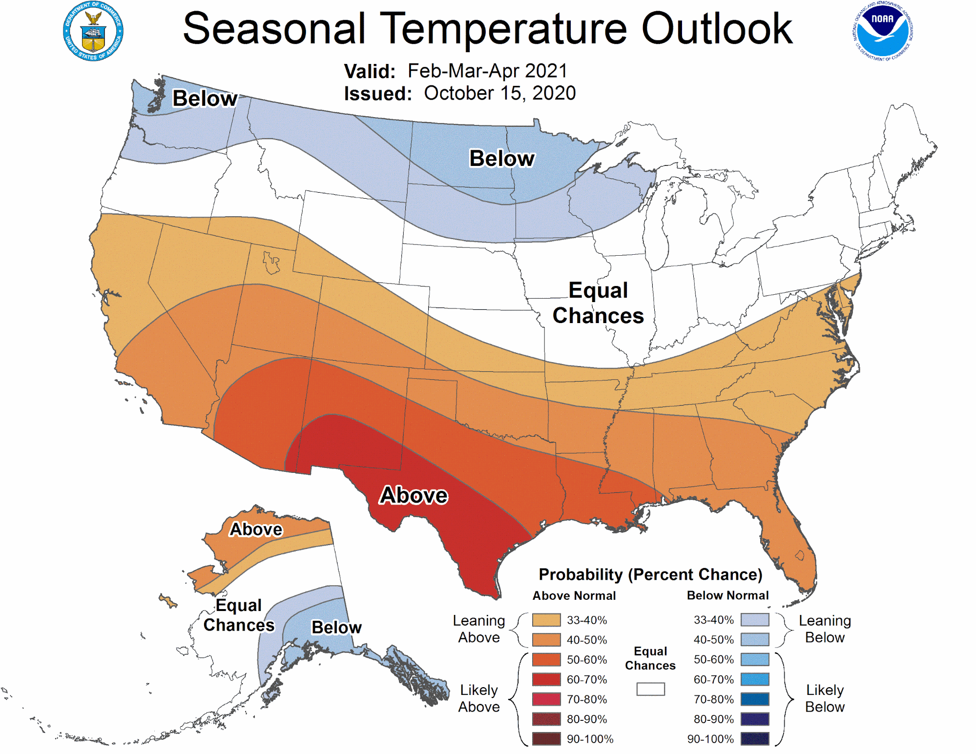
This sample temperature map shows areas of above- and below-normal 3-month seasonal average temperatures, with some areas labeled “EC” or equal chances - where there is no tilt in the odds towards either an above-, near- or below-average outcome. The new maps include a more comprehensive legend to better explain the different colors and probabilities. |
“After considerable research and collaboration with partners and users, we are pleased to offer these now-operational upgraded climate outlook maps for our partners and the public,” said Jon Gottschalck, Climate Prediction Center. “Since our efforts on this project began in 2017, our team at CPC has worked collaboratively and creatively to deliver these newly-visualized maps to our stakeholders.”
To develop the new look and feel for the maps, CPC worked with the University of Maryland (UMD) Cooperative Institute for Satellite Earth System Studies (CISESS). In addition, user feedback was also incorporated to ensure the upgraded maps deliver on their goal of clearly communicating upcoming climate outlooks. “Our goal was to engage users to test which maps were understood the best. We want even more people to use NOAA data to support their decisions and social science research provides cost efficient answers on what works best,” said project lead Melissa Kenney from the University of Minnesota’s Institute on the Environment and UMD CISESS.
Future maps, including those for the Week 3-4 temperature and precipitation outlooks, will also undergo a visual upgrade in the future. To learn more about the science behind these upgraded map products, read more in the American Meteorological Society article: Using Visualization Science to Improve Expert and Public Understanding of Probabilistic Temperature and Precipitation Outlooks.