Day 3-4 |
Day 5-6 |
Day 3-4 |
Day 5-6 |
pWind Speed
|
pGust Speed
|
pWind Speed
|
pGust Speed
|
f24
|
f36
|
f48
|
f60
|
f72
|
f84
|
f96
|
f108
|
f120
|
f132
|
f144
|
f156
|
f168
|
f180
|
f192
|
f204
|
f216
|
f228
|
f240
|
f252
|
f264
|
f276
|
f288
|
f300
|
f312
|
f324
|
f336
|
f348
|
f360
|
f372
|
f384
|


 |
 |
 |
 |
 |
 |
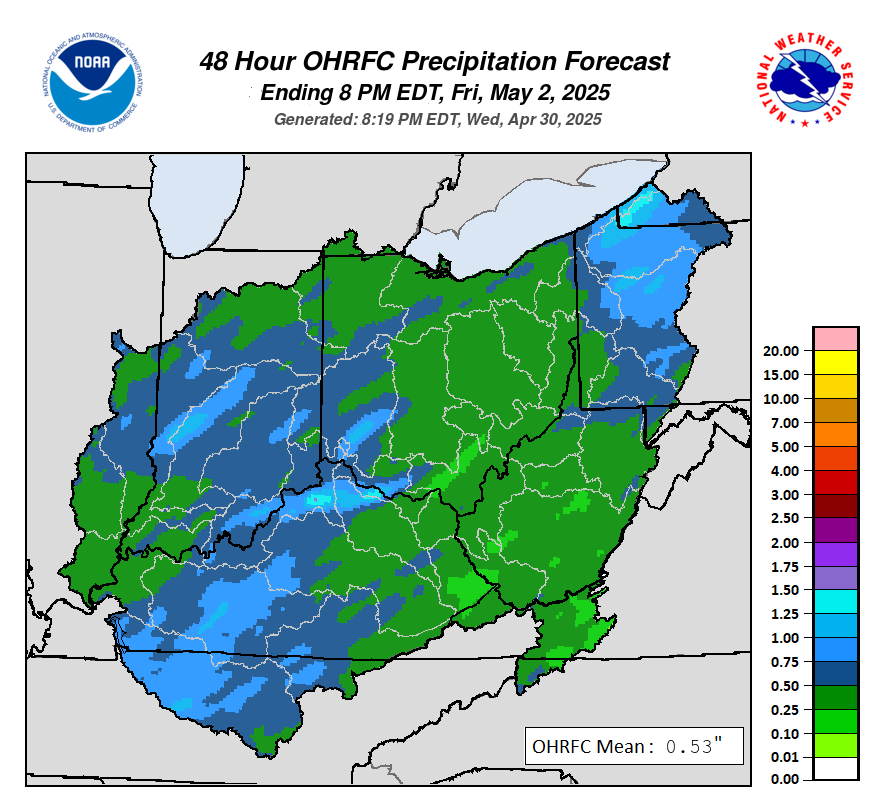
Official 48 Rainfall Forecast from the OHRFC (Used in River Forecasts)
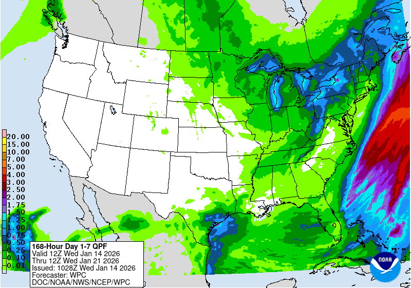
WPC 7 Day Forecasted Rainfall
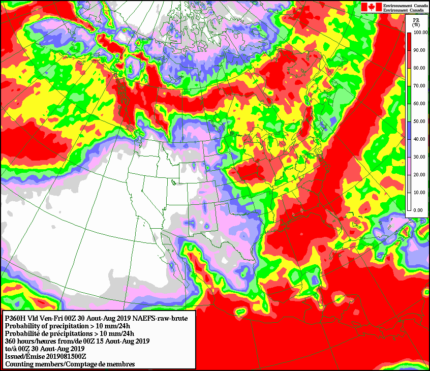
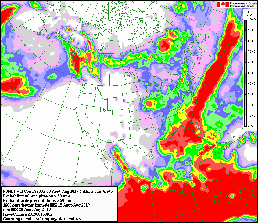
NAEFS 16-day Ensemble Mean Precipitation Forecast

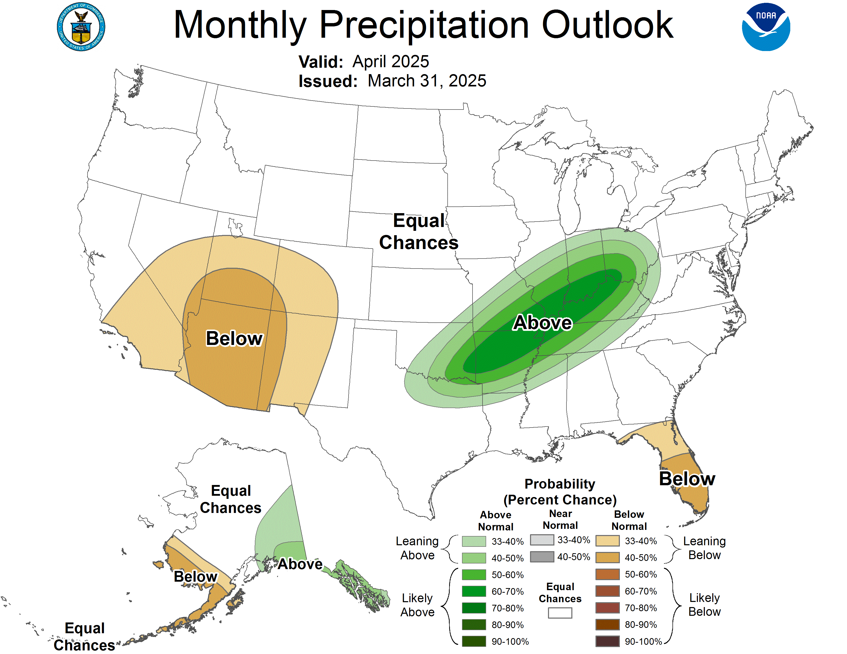
Climate Prediction Center Rainfall Outlooks
 |
 |
 |
 |
** note units **
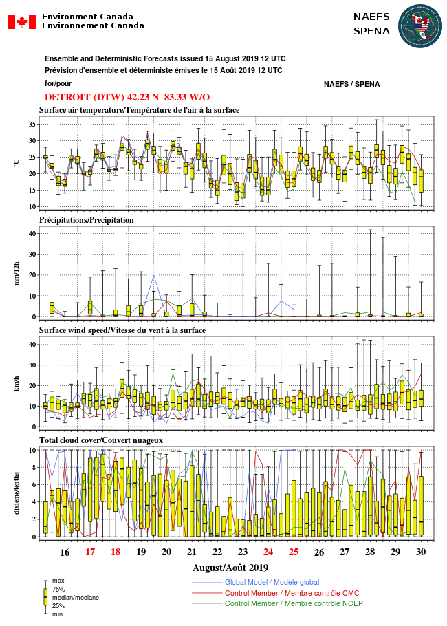
Detroit
|
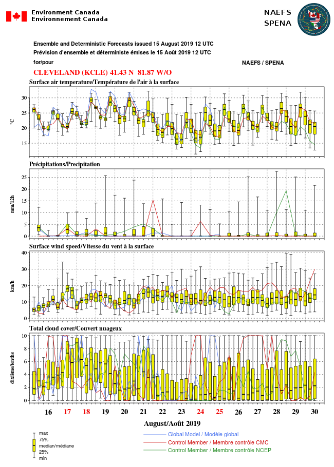
Cleveland
|
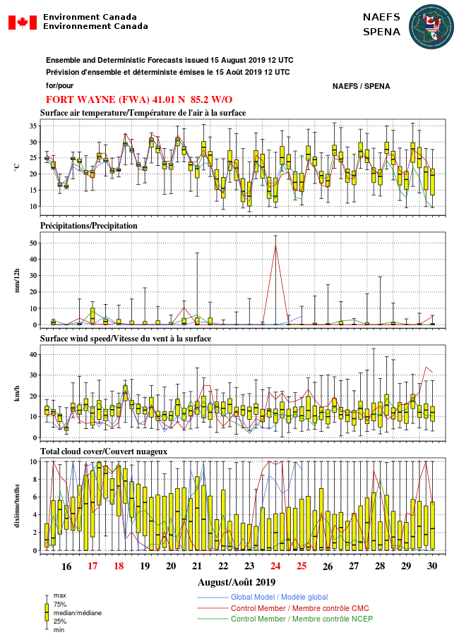
Fort Wayne
|
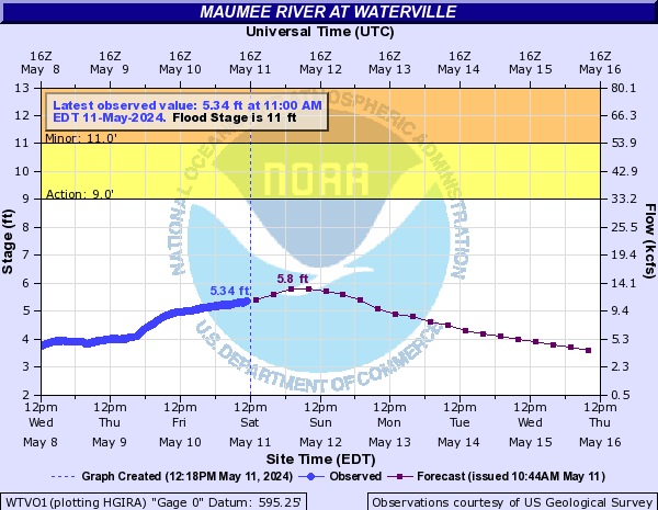
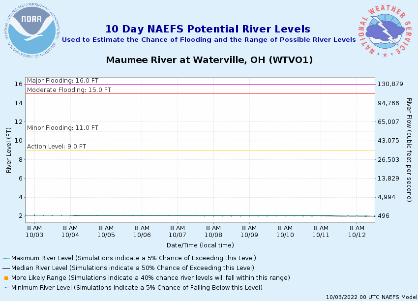
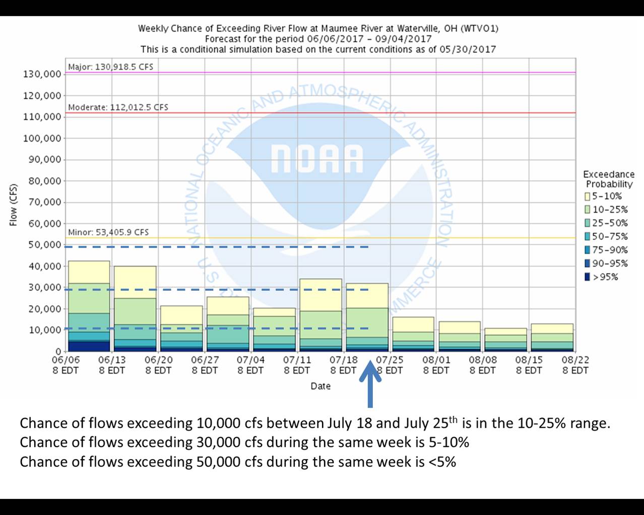
Official River Forecasts for the Maumee River at Waterville (NWS AHPS)
OHRFC 30 and 60 Day Streamflow Outlooks
 |
 |
 |
|
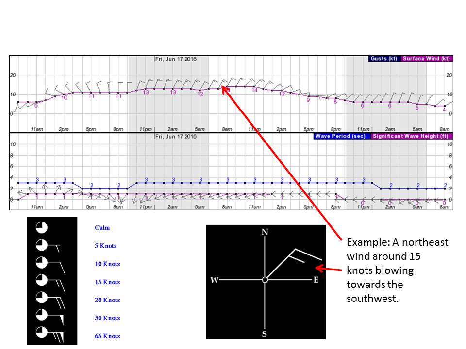
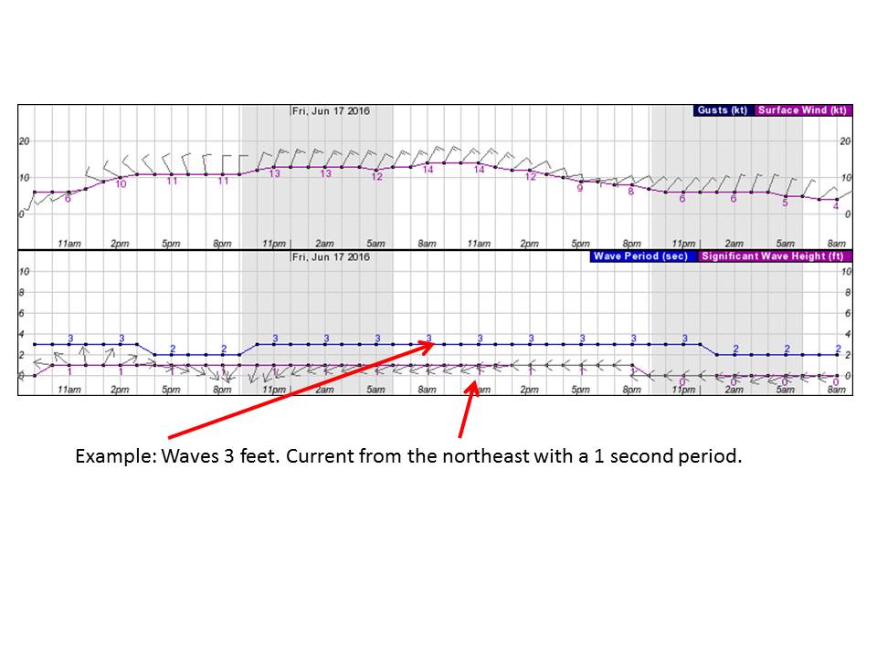
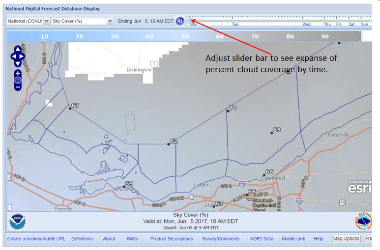
The hourly wind and wave graphics depict the wind direction, speed, wind gust speed, wave heights, wave period, and current direction out for 2 day increments. |
|
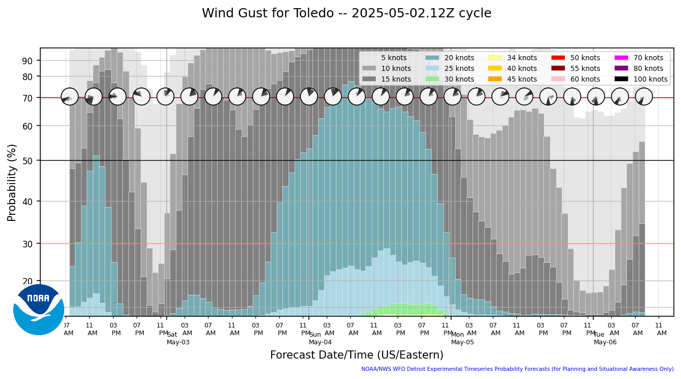
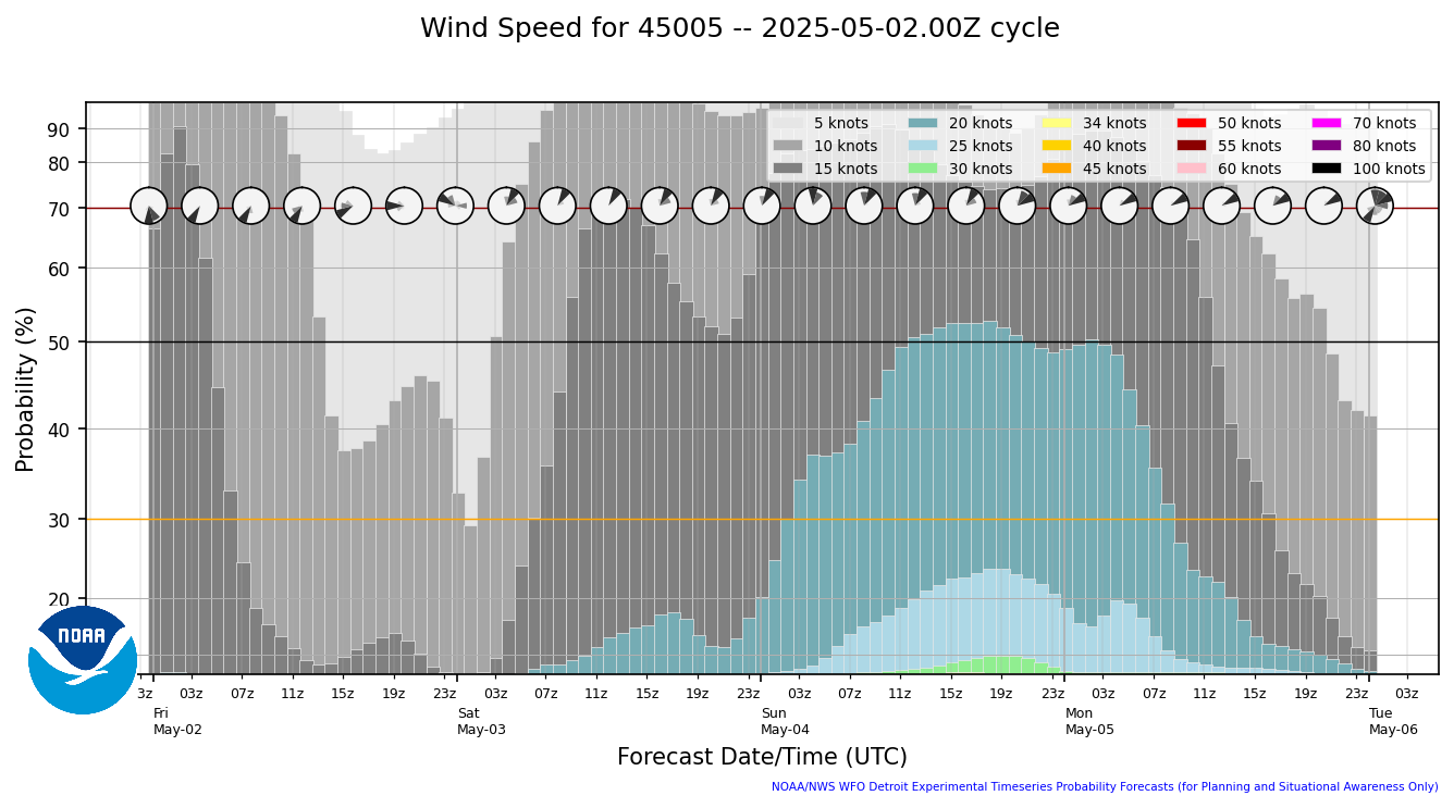
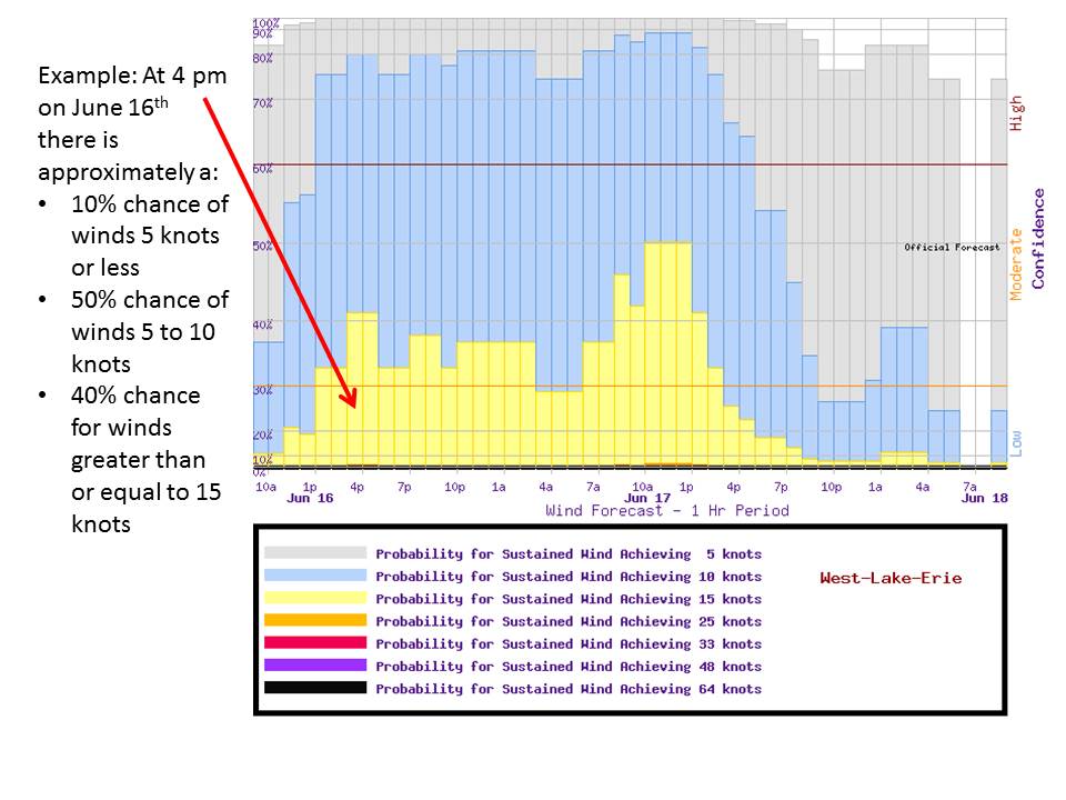
The hourly wind probability graphics depict the percent chance of a certain wind speed range being observed during that hour. |
|
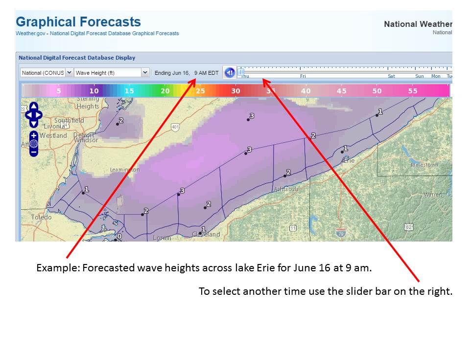
The NWS issues graphics on wave height for the American waters of Lake Erie. These graphics are visible using the National Digital Forecast Database Display. The wave heights are in feet. |
|
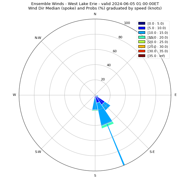
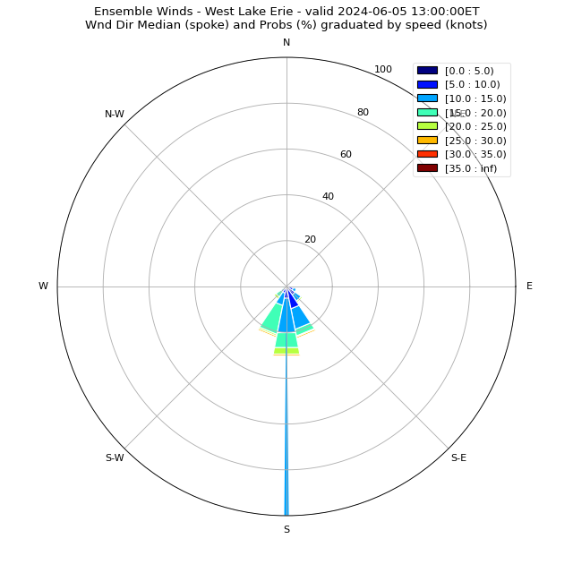
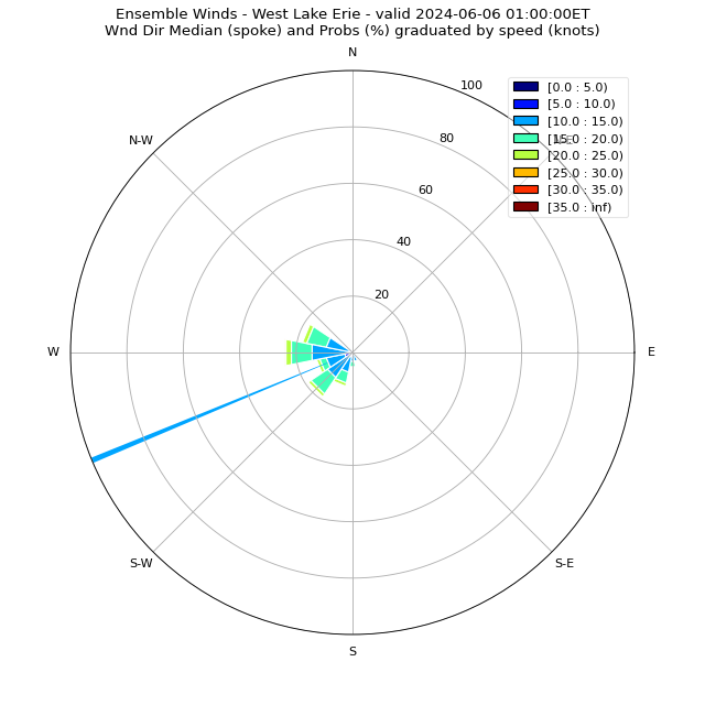
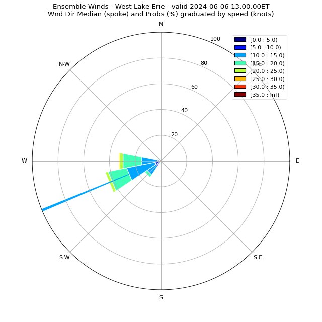
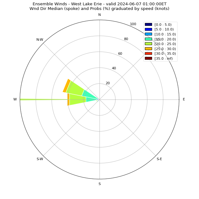
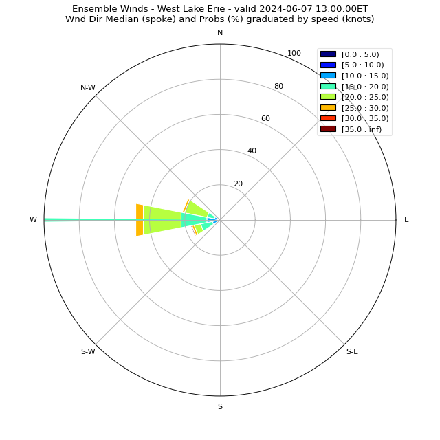
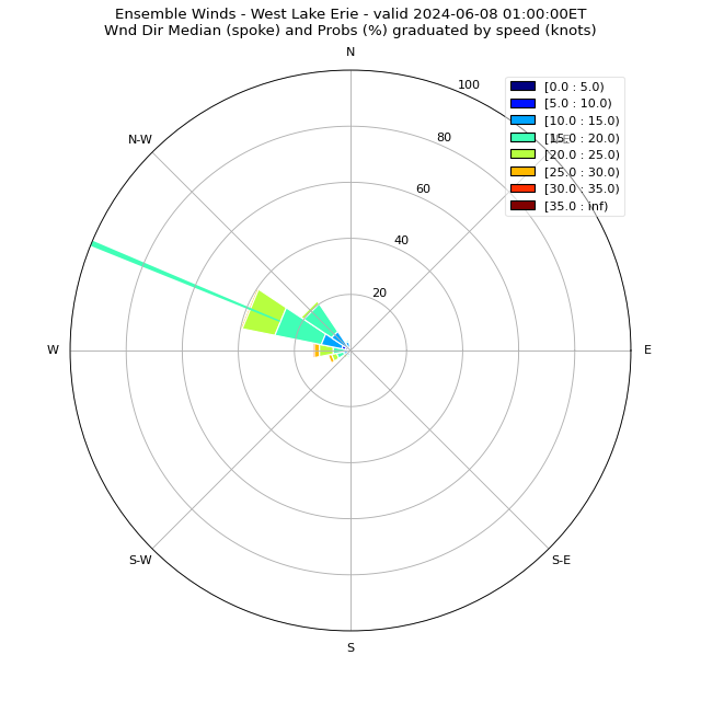
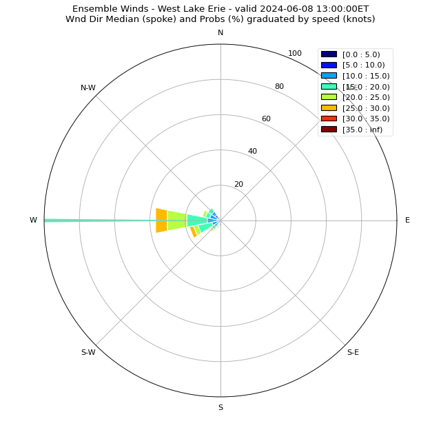
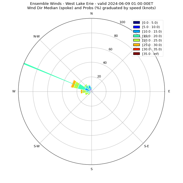
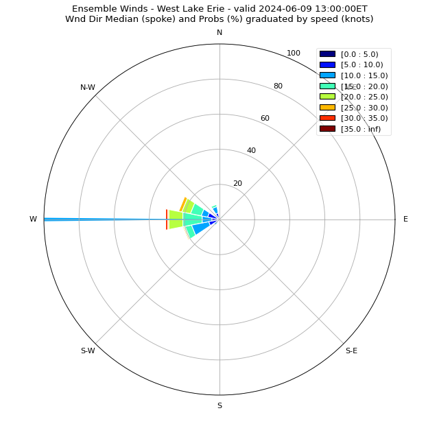
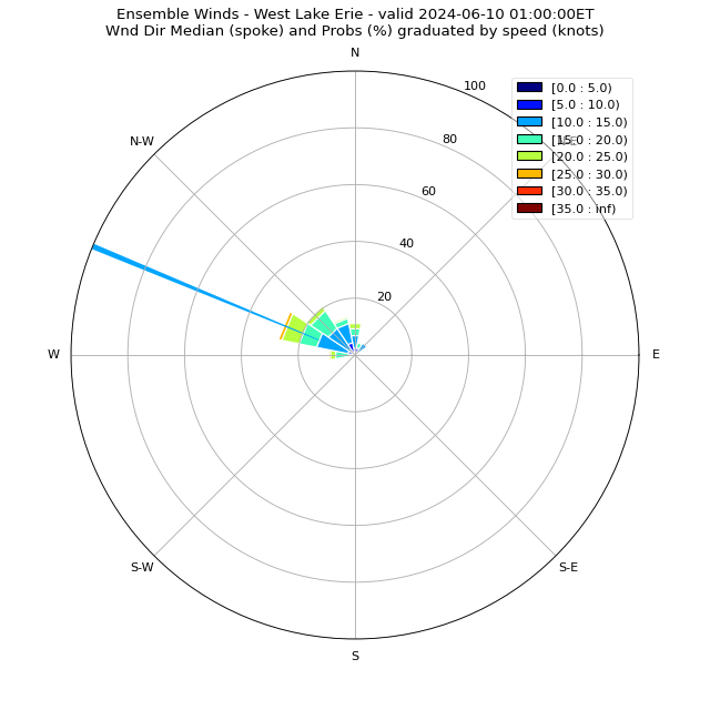
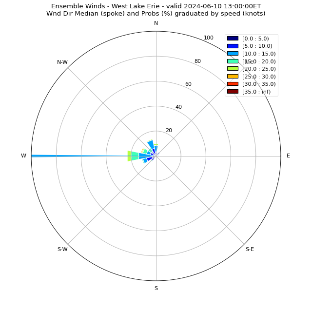
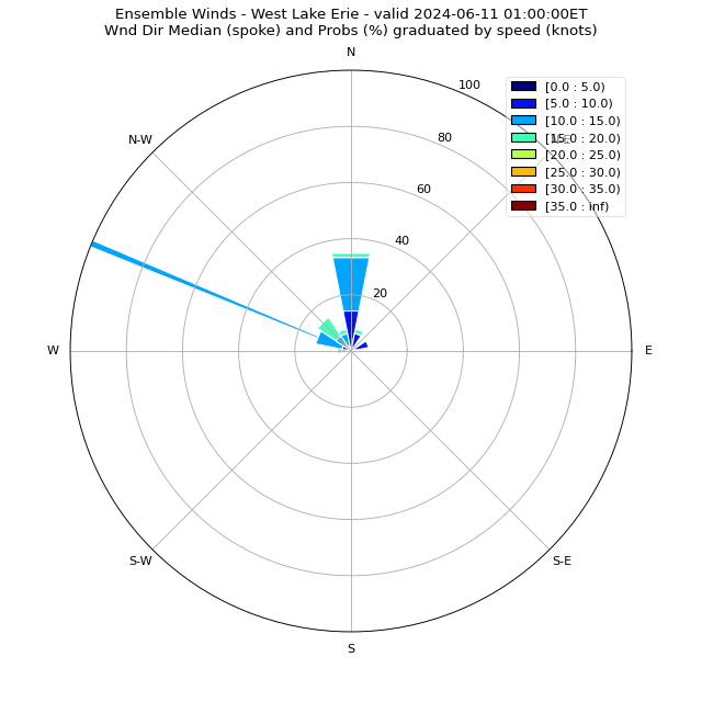
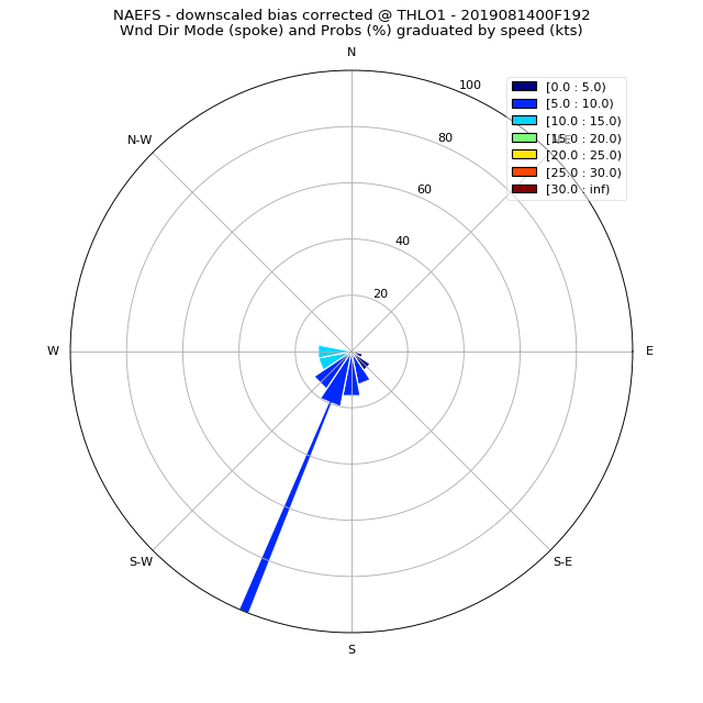
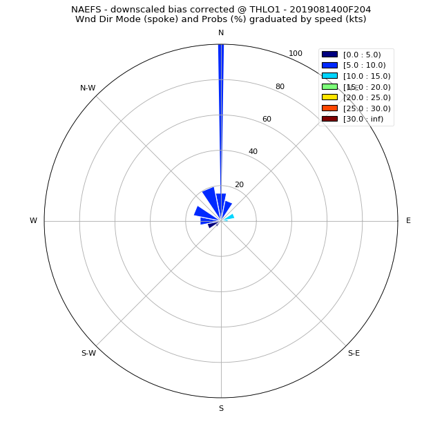
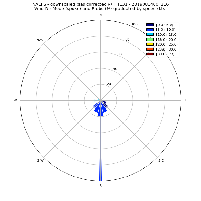
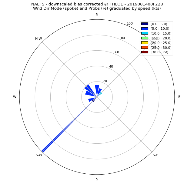
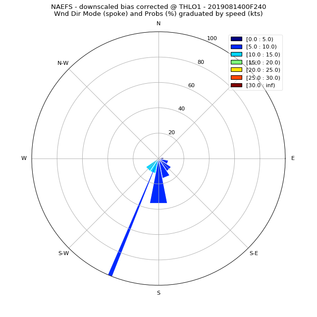
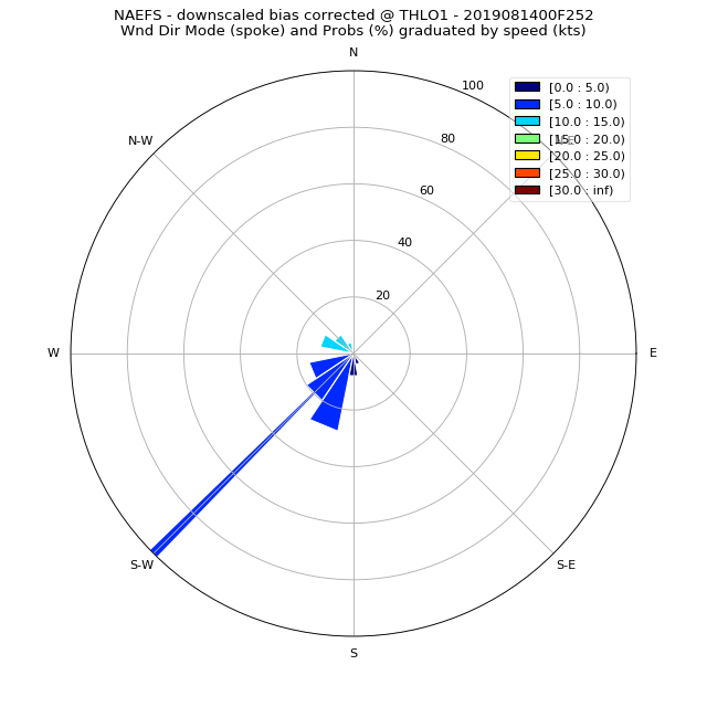
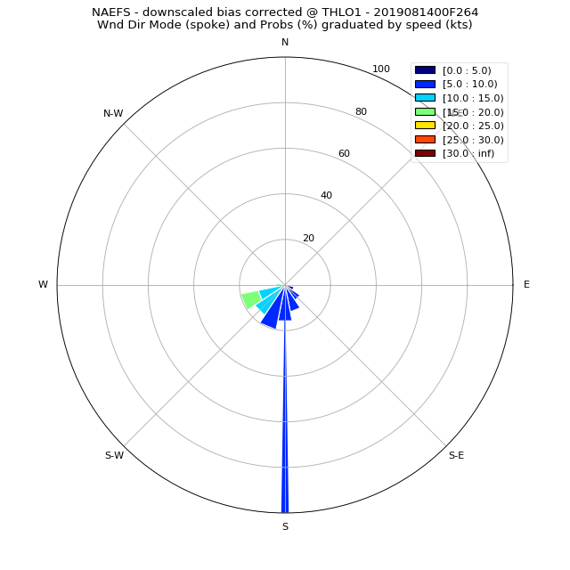
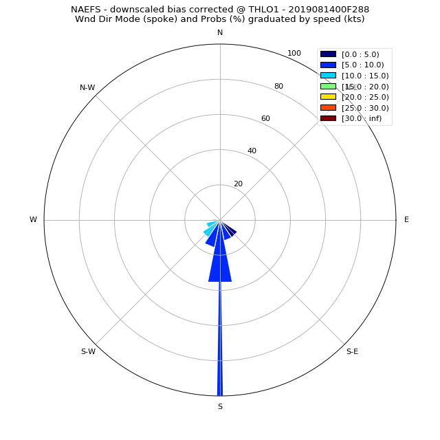
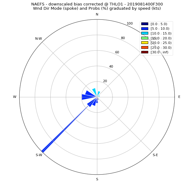
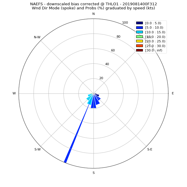
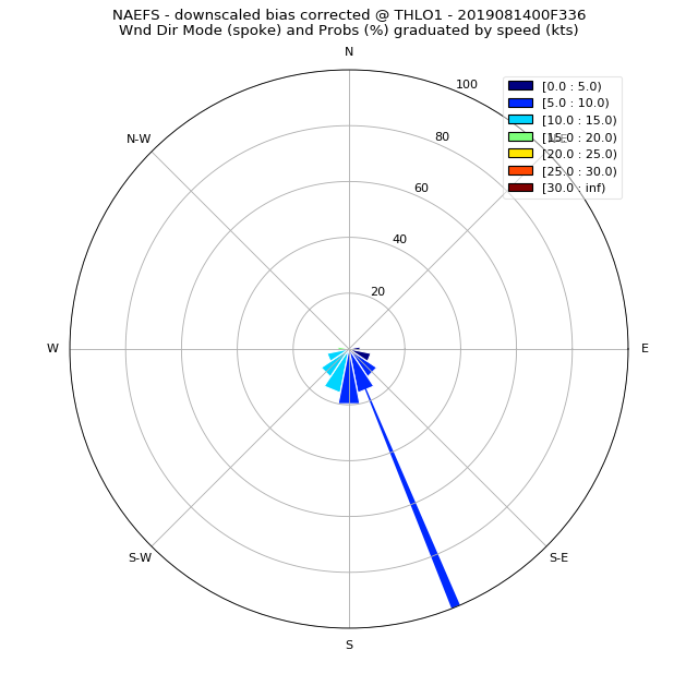
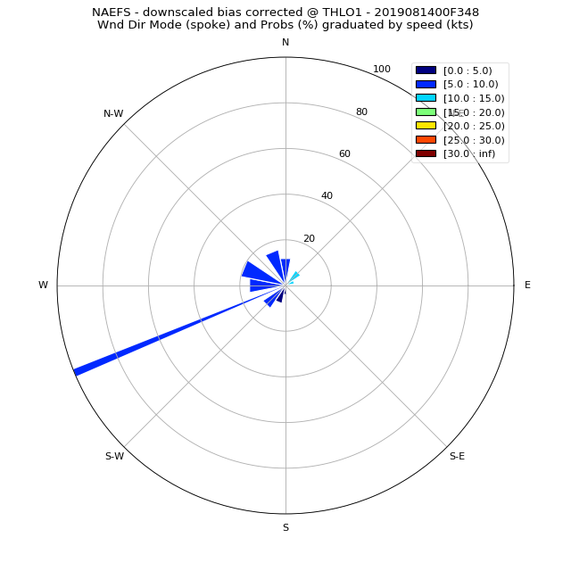
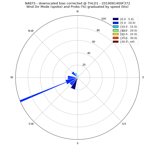
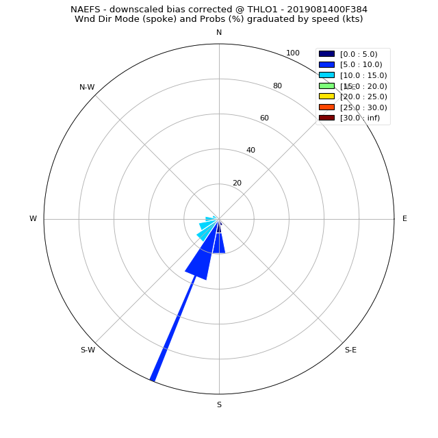
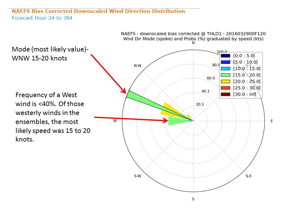
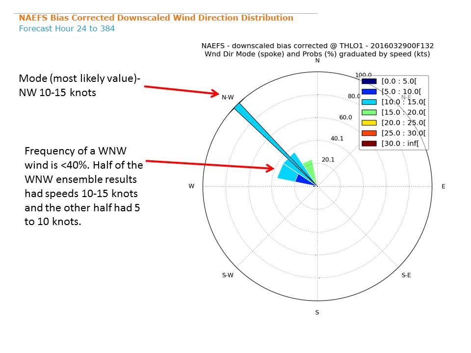
The wind rose chart shows the frequency and speed of wind blowing from each direction from 24 to 384 hours from the initial model run time. Reading the wind rose. Each spoke is divided by color into wind speed ranges. The radial length of each spoke around the circle is the percentage of time that the wind blows from that direction, with the exception of the mode which will always extend to the outer ring. As you move outward on the radial scale, the frequency associated with wind coming from that direction increases. |

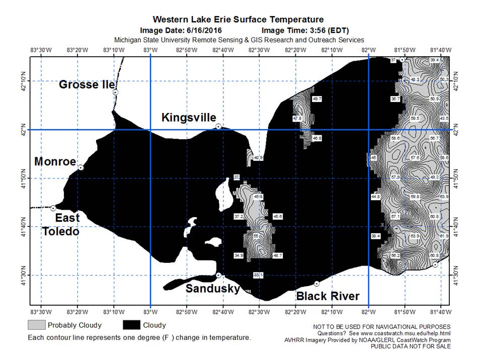
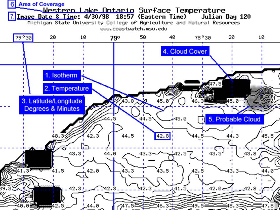
The Great Lakes surface water temperature estimates presented in this website are automatically generated from satellite-derived sensors. Obvious errors or anomalies may be present in the resulting images as a result of satellite sensor malfunctions, adverse atmospheric conditions, or processing errors. Cloud covered areas of the lake surface cannot be read accurately by NOAA satellites so the computer program colors them black. Areas near the black masked cloud cover may not be as precisely reported as those some distance from the clouds. CoastWatch images are generally representative of surface temperature conditions, they are not as accurate as your road atlas. Some areas are masked with grey color because the computer program has indicated the temperatures presented are probably cloud temperatures. The air temperature at the tops of clouds can sometimes be very nearly the same as the surface water temperature of the lakes below. The grey-scale masking indicates that the accuracy of temperature reporting is lower at this time. Watching CoastWatch temperature patterns over the days, weeks and seasons provides useful information on lake surface temperatures.
|
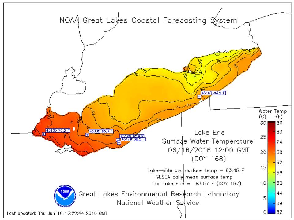
The NOAA Great Lakes Coastal Forecasting System (GLCFS) is a set of models that simulate and predict the 2-D and 3-D structure of currents, temperatures, winds, waves, ice, and more in the Great Lakes. Their models use current lake conditions and predicted weather patterns to forecast the lake conditions for up to 5 days in the future. These forecasts are run twice daily, and you can step through these predictions in hourly increments, or view animations over this time period. Nowcasts and forecasts are generated throughout the day in near-realtime. The GLCFS uses a modified Princeton Ocean Model, developed by GLERL and the Ohio State University, and is supported by the National Weather Service. |
The rainfall tab consists of observed, forecasted, and outlooked rainfall for the region. The sources are a combination of Ohio River Forecast Center, Climate Prediction Center, and the NAEFS/GEFS ensemble forecast models.
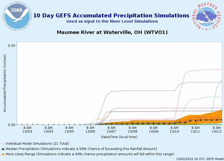
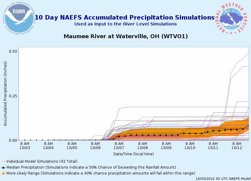
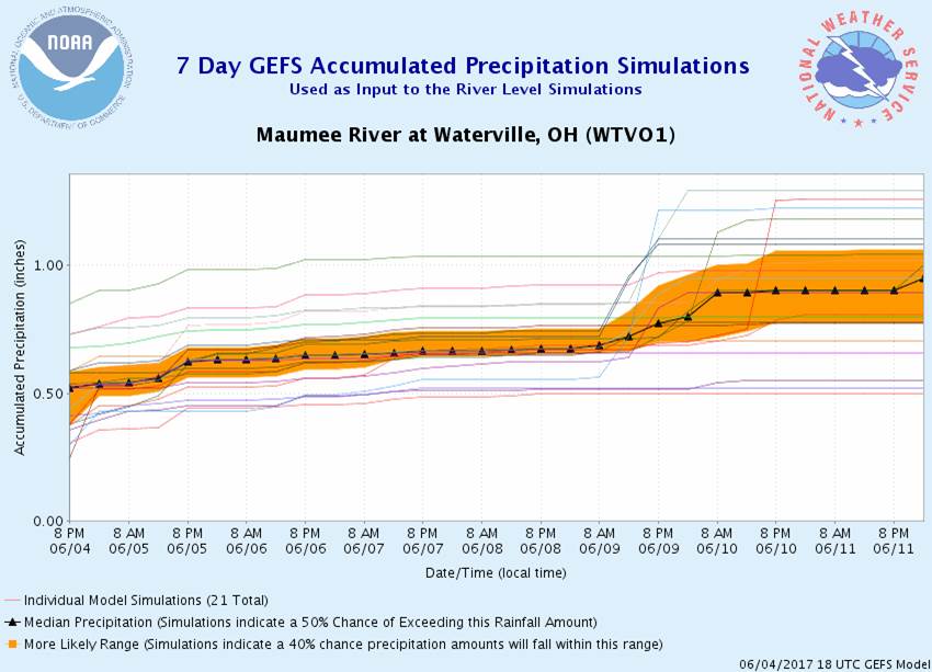
Here is an example of the GEFS Accumulated precipitation graphic from the MMEFS. The ensembles help define the amount of uncertainty in the rainfall forecasts. The GEFS has 21 members from the GFS out for 168 hours. The NAEFS has 42 members, 21 from the GFS and 21 from the GEM models out to 168 hours. The black line with triangles denotes the median model accumulations.
|
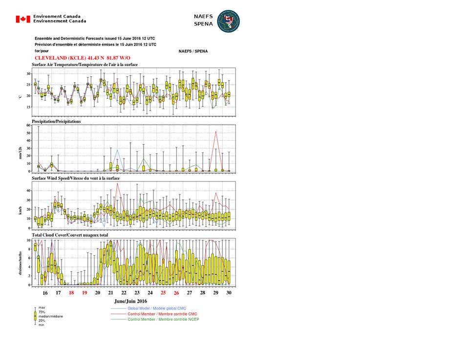
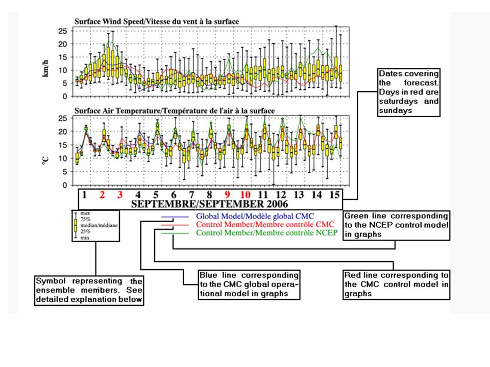
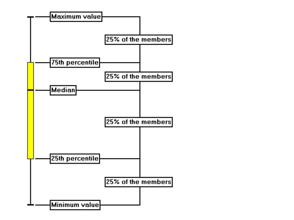
The outlook plots are model ensembles for points around western Lake Erie. The NAEFS is a Canadian and American ensemble plot. An EPSgram image contains from one to four graphs, each one representing the forecast of a single meteorological variable for 15 days. The ensemble forecasts generated every day at 0 UTC and 12 UTC are used. In each graph of an EPSgram the operational model and the control model of the Canadian system, the American control model and the 40 models of both ensemble system combined are represented. How to read the EPSgram. The yellow rectangle symbol with two vertical lines added, represent the dispersion of the meteorological variable for the members of the ensemble at a given time. The upper vertical black line contains the values of the 25% of the members for which the variable is the highest. The upper limit of that line is the value of the highest member. The yellow rectangle contains 50% of the members for which the value is intermediary (lower than the upper 25% and higher than the lower 25%). This rectangle is separated by a median. The portion of the rectangle higher than the median contains 25% of the members. The portion under the median contains another 25% of the members. The lower vertical black line contains the values of the 25% of the members for which the variable is the lowest. The lower limit of that line is the value of the lowest member. |
Prototype: Under Development: Not to be relied on for Operational Decision Making.