Miami - South Florida
Weather Forecast Office


Monthly plots for each station can be viewed by clicking on the station name below.
Fort Lauderdale-Hollywood (KFLL)
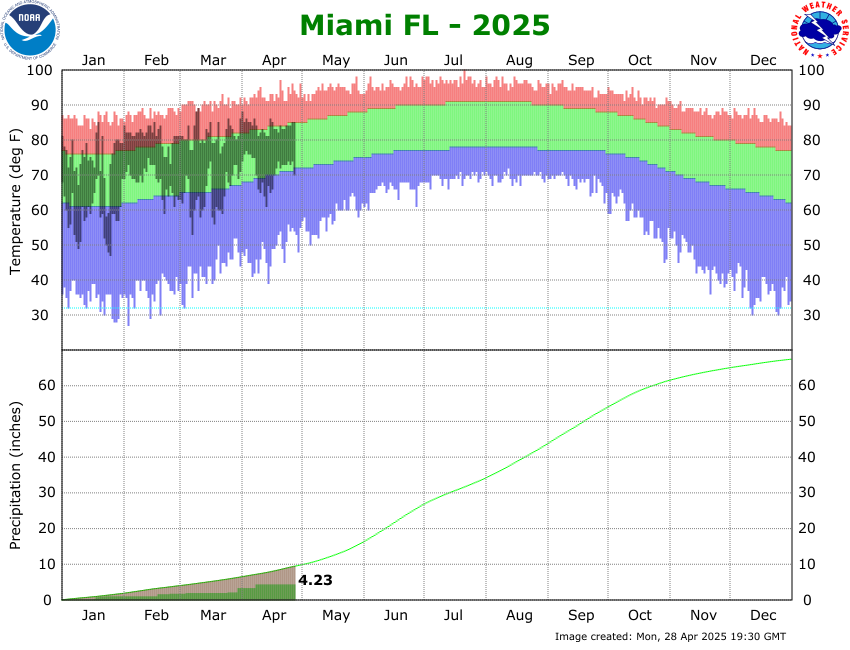
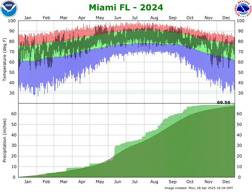
For the yearly plots shown above, observed temperatures are shown by the dark blue areas, normals with the light green areas, record highs in the light red areas, and record lows in the light blue areas. The bottom portion of the graph indicates the precipitation for the year to date. The yellow line (and green area below it) represents the normal year to date total at the given time frame. Periods that have year to date totals above the climatological normals are shown by dark green areas above the yellow line. Periods that are below normal are shown with the brown areas below the yellow line.
Below is an example of the monthly climate plot. The observed high and low temperatures are indicated by the tops and bottoms of the vertical dark blue bars, respectively. The normal temperature ranges are indicated by the green band. Record highs are shown on the top of the light pink band, and record lows are indicated along the bottom of the light blue band.
CURRENT HAZARDS
Submit a Storm Report
Outlooks
Graphical Hazardous Weather Outlook
Self Briefing Page
National Hazards
Tropics / Hurricanes
Local Storm Reports
CURRENT WEATHER
Surface Observations
Satellite
Observed Precipitation
MesoAnalysis
Rivers / Lakes
Latest Sounding
Lake Okeechobee
PAST WEATHER
Tropical Cyclone Reports
Past Events
Recent Rainfall
FORECASTS
Forecast Discussion
Tropical Weather
Probabilistic Page
Heat Page
Cold Weather Page
Marine Weather
Fire Weather
Beach Forecast
Aviation Weather
Probabilistic QPF
Hourly Forecasts
Activity Planner
Graphical Forecast
International Weather
RADAR IMAGERY
National
Miami Radar
Key West Radar
Across Florida
CLIMATE
Local Climate Info
More Local Climate Info
Climate Graphs
US Dept of Commerce
National Oceanic and Atmospheric Administration
National Weather Service
Miami - South Florida
11691 SW 17th Street
Miami, FL 33165
305-229-4522
Comments? Questions? Please Contact Us.