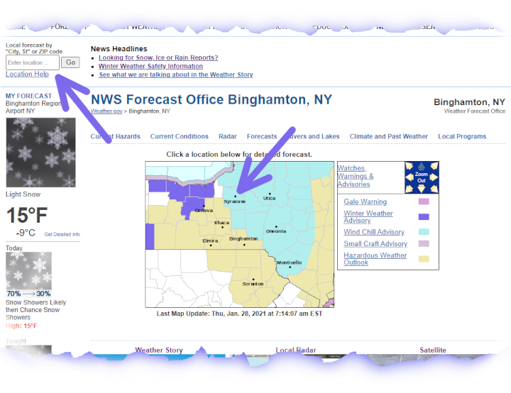
For this example, National Weather Service at Binghamton, NY will be used.
The example image below shows how to get a forecast. Click either on the map nearest your location, or enter a location, City, State or Zipcode into the box in the upper left of the web page.
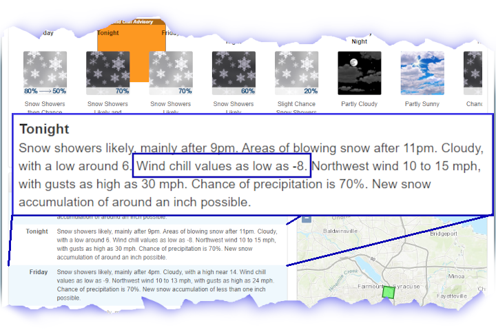
Once either of these steps are complete, a new page will appear with the forecast, this is also called the "point and click" forecast. The page is long so scroll down to the text part of the forecast. In this example, the forecast is for windchill values as low as -8 degrees F.
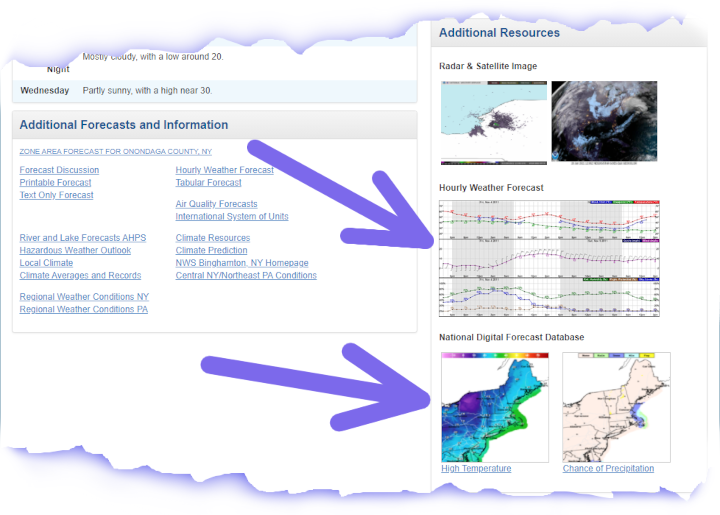
Farther down the page are links for additional forecast displays, as shown by the blue arrows below. One is an hourly graph and the other is display on a map.
Clicking on the Hourly Weather Graph image will produce a graph based forecast, or meteogram. Note that the blue arrows in the image below. The arrows show the settings and where to look for the Windchill forecast on this type of web page. In this example, the light brown line shows the Windchill forecast.
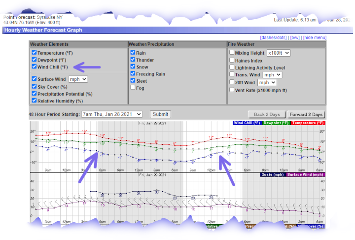
The Hourly Weather Graph can also display the following forecast weather elements:
| Public Forecast Weather Elements | Fire Weather Forecast Elements |
|
|
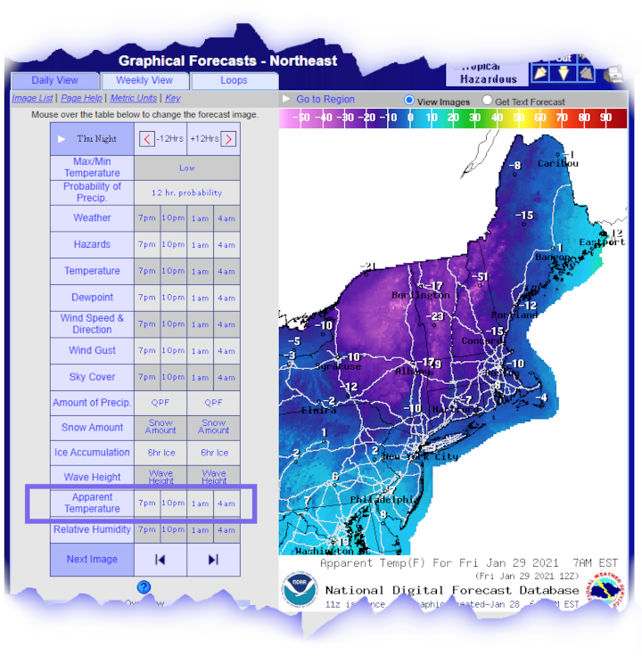
Lastly, back on the "point and click" forecast page there was a link to the National Digital Forecast Database. This is where graphical forecasts can be found. These forecasts are displayed on a map for the entire country, parts of the country, or for local National Weather Service forecast areas.
The example image below shows the graphical forecast for the parts of the northeast United States. Clicking on the map will zoom it in a bit more. In this type of page you can use your mouse to move over the forecast element times to change the image displayed.
Note the blue highlighted area. It is a forecast for Apparent Temperature. Apparent Temperature during the summer time is the same as Heat Index. During the winter it would be the same as Wind Chill.
This graphical forecast page is planned to be replaced by the map viewer now operationally available at digital.weather.gov.
Give it a try for your location, and if you have any questions, please either send an email to the webmaster or post a question on Facebook or Twitter.
Additional Information: