Buffalo Climate Plot:
Switch to Rochester Climate Plot
Click on the images below to enlarge
Monthly Temperature Plots:
|
|
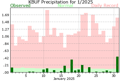
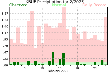
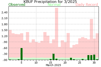
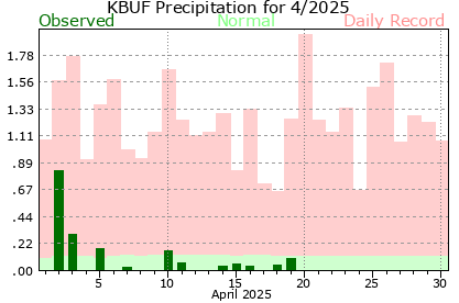
Monthly Precipitation Plots:
|
How to Read the Plots:
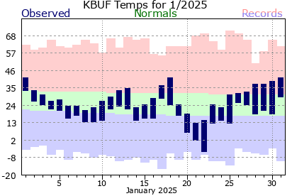
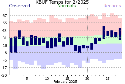
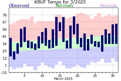
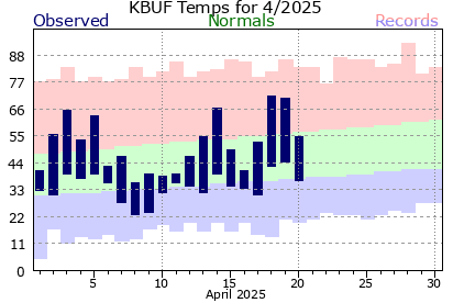
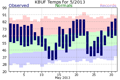
This is an example of the monthly climate plot. The observed high and low temperatures are indicated by the tops and
bottoms of the vertical blue bars, respectively. The normal temperature ranges are indicated by the green band. Record
highs are shown on the top of the light pink band, and record lows are indicated along the bottom of the light blue band.
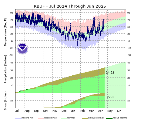
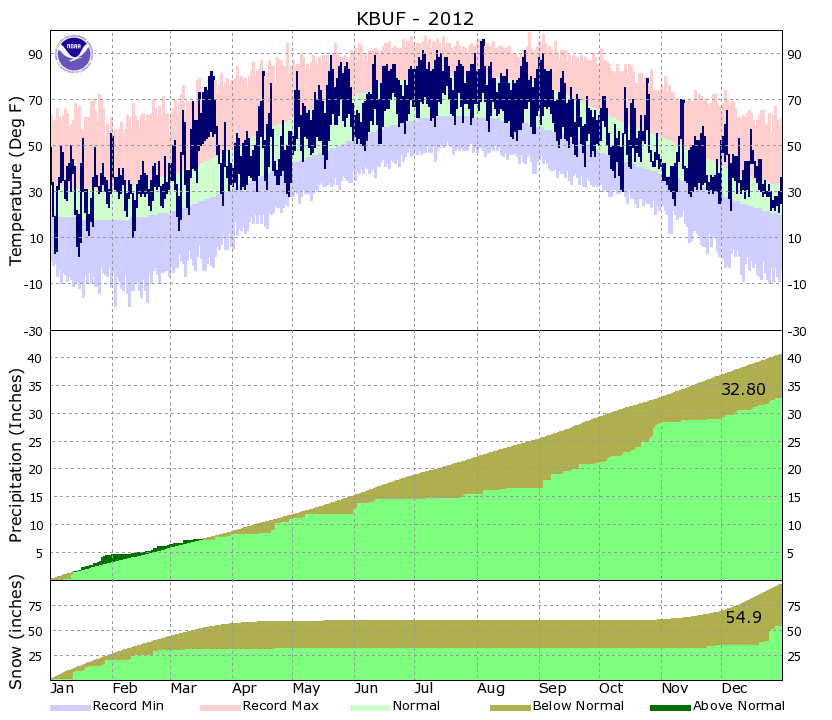
This is an example of the year to date climate plot. As with the monthly plot, observed temperatures are shown
by the dark blue areas, normals with the light green areas, record highs in the light red areas, and record lows
in the light blue areas. The bottom portion of the graph indicates the precipitation for the year to date. The yellow
line (and green area below it) represents the normal year to date total at the given time frame. Periods that have
year to date totals above the climatological normals are shown by dark green areas above the yellow line. Periods
that are below normal are shown with the brown areas below the yellow line.
|
|
|