Houston/Galveston, TX
Weather Forecast Office
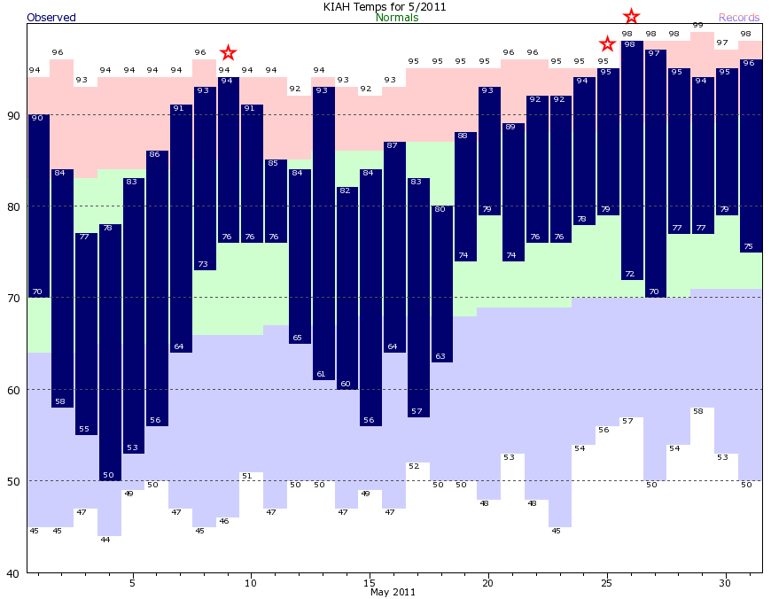
You are at WFO Houston/Galveston » SE TX Climate Pages » Climate Graphs - How to read
CURRENT HAZARDS
-National Hurricane Center
-Storm Prediction Center
-Weather Prediction Center
-River Forecast Centers
-Aviation Weather Center
-Center Weather Service Units
-Spaceflight Meteorology Group
-Space Weather Prediction Center
CURRENT WEATHER
-Tides and Currents
-Observations
-Satellite
-Rainfall Reports
-Public Information Statement
-Galveston Beach Patrol (Flag Warning System)
FORECASTS
-Activity Planner
-Forecast Discussion
-Marine
-Tropical
-Aviation
-Fire
-Beach
-Models
-Drought
History
-Our Office
-National Weather Service
-NOAA
-Major Events
RADAR
-Houston/Galveston
-National
-Corpus Christi
-Lake Charles
-Austin/San Antonio
-Granger (Central Texas)
-Worldwide
-Education
Rivers/Lakes/Bayous
-Lower Colorado River Authority
-Harris County Flood Warning System
-Local
-National
-Jefferson County Drainage District 6
-Brazos River Authority
CLIMATE
-Houston Intercontinental
-Houston Hobby
-Galveston
-College Station
-Palacios
-Graphs
-Climate Summaries
-Local Data/Records
-Old Climate Page
-NCEI
-Storm Data
-Weather History
-Wind Roses
Education/Careers
-National Weather Service
-Careers
-Web Weather for Kids
-HGX Teacher Resources
-more
PREPAREDNESS/SAFETY
-Evacuation Planning
-Publications/Brochures
-StormReady
-2025 Hurricane Guide
-2025 Hurricane Guide (Spanish)
-SKYWARN Schedule
-FloodAware
-Weather Radio
-Evacuation ZipZone
-Evacuation Routes
-more
ADDITIONAL INFO
-Weather Ready Nation
-Weather Safety
-Severe Stats
-Air Now
-CoCoRaHS
-Miscellaneous Info
-Astronomical Info
-Frequent Products
-Find It Quick
-Watch, Warning, and Advisory Criteria
Tropical
-Preparedness Meetings
-Historical Tracks
-Education
-Climatology for SE TX
-Hurricane Harvey
-Hurricane Alicia
-Tropical Storm Imelda
-Local Page
US Dept of Commerce
National Oceanic and Atmospheric Administration
National Weather Service
Houston/Galveston, TX
1353 FM 646 Suite 202
Dickinson, TX 77539
281-337-5074
Comments? Questions? Please Contact Us.